
Bars and Rankings
Bars answer categorical magnitude questions through length from a shared baseline. Sort them when rank is part of the question, keep a semantic order when sequence matters, and use a lighter comparison mark when a filled bar would overstate the data.
Choose the comparison
| Reader question | Start with |
|---|---|
| Which category has the largest or smallest value? | Sorted bars |
| Which categories have notable endpoints without emphasizing area? | Lollipops |
| How far apart are two values for each category? | Dumbbells |
| How do signed contributions bridge from a start to a total? | A waterfall |
| How do subgroups contribute to each category? | Grouped or stacked bars in Stacked and Composed Charts |
Use horizontal bars when labels are long or when the rank itself should read top to bottom. Layout, Axes, and Coordinates shows how categorical orientation and automatic guide margins fit together.
Rank categories with bars
Sorting the scale domain makes the intended ranking explicit. Sorting only the input rows is insufficient when several layers or prepared datasets share the same categorical axis.
import { barY, defineChart } from '@tanstack/charts'
import { scaleBand } from '@tanstack/charts/scales/band'
import { scaleLinear } from '@tanstack/charts/scales/linear'

const rows = [
  { category: 'Search', value: 84 },
  { category: 'Direct', value: 63 },
  { category: 'Referral', value: 47 },
  { category: 'Social', value: 31 },
]

const ranked = [...rows].sort((a, b) => b.value - a.value)

const chart = defineChart({
  marks: [barY(ranked, { x: 'category', y: 'value', inset: 2 })],
  scales: {
    x: {
      scale: () =>
        scaleBand<string>()
          .domain(ranked.map((row) => row.category))
          .padding(0.16),
    },
    y: {
      scale: scaleLinear,
      nice: true,
      grid: true,
      axis: { label: 'Weekly signups' },
    },
  },
})

export default chart
Open the larger catalog case to inspect responsive label rotation and data updates.
Bar charts normally include zero on the quantitative domain. Truncating that baseline turns small differences into large apparent changes.
Reduce visual weight with lollipops
A lollipop keeps the common baseline and precise endpoint while replacing the filled rectangle with a thin link. It is useful for many categories or when the endpoint matters more than area.

Compose the stem and endpoint as separate marks. The Rules, Links, Arrows, Vectors, and Ticks reference defines the link channels; Dot and Hexagon Marks defines the endpoint layer.
Compare two values per category
Dumbbells emphasize the distance and direction between two endpoints without implying the combined area of grouped bars.
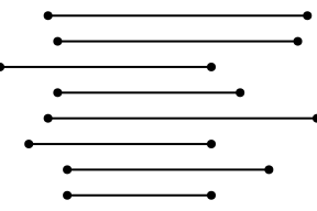
Label the endpoint semantics in a legend or surrounding text. If chronological order between two periods is the message, a slopegraph may be more direct; if absolute magnitudes must remain independently comparable, use grouped bars.
Explain a bridge to a total
A waterfall requires cumulative preparation. Each contribution becomes an explicit lower and upper interval; the renderer should not guess whether a row is a delta, subtotal, or total.

Keep the cumulative calculation in application data preparation and pass the prepared interval channels to a ranged bar or rectangle. The ownership boundary is described in Scales, and the geometry contracts are in Bar and Rect Marks.
Production checks
- Preserve a semantic category order unless rank is the question.
- Include zero for ordinary bar magnitudes; use explicit interval endpoints for floating and waterfall bars.
- Avoid encoding the same distinction only by color. Labels, position, and shape can carry the essential comparison.
- Verify long labels and rotated ticks with Responsive Charts.
- Preserve unique category values when bars reorder or animate; supply key only when the category does not identify a row. See Dynamic Data and Animation.
'%3e%3cpath%20d='M117.436%20207.036V154.604L118.529%20153.51H129.452L130.545%20154.604V207.036L129.452%20208.13H118.529L117.436%20207.036Z'%20fill='%2305BDBA'/%3e%3cpath%20d='M117.436%2053.5225V1.09339L118.529%200H129.452L130.545%201.09339V53.5225L129.452%2054.6159H118.529L117.436%2053.5225Z'%20fill='%2305BDBA'/%3e%3cpath%20d='M69.9539%20169.238H68.4094L60.6869%20161.512V159.967L78.7201%20141.938L86.8976%20141.942L87.9948%20143.031V151.209L69.9539%20169.238Z'%20fill='%2305BDBA'/%3e%3cpath%20d='M69.9462%2038.8917H68.4017L60.6792%2046.6181V48.1626L78.7124%2066.192L86.8899%2066.1882L87.9871%2065.0986V56.9212L69.9462%2038.8917Z'%20fill='%2305BDBA'/%3e%3cpath%20d='M1.09339%2097.5104H75.3711L76.4645%2098.6038V109.526L75.3711%20110.62H1.09339L0%20109.526V98.6038L1.09339%2097.5104Z'%20fill='%2305BDBA'/%3e%3cpath%20d='M440.999%2097.5104H510.91L512.004%2098.6038V109.526L510.91%20110.62H436.633L435.539%20109.526L439.905%2098.6038L440.999%2097.5104Z'%20fill='%2305BDBA'/%3e%3cpath%20d='M212.056%20108.727L210.963%20109.821H177.079L175.986%20110.914C175.986%20113.101%20178.173%20119.657%20186.916%20119.657C190.196%20119.657%20193.472%20118.564%20194.566%20116.377L195.659%20115.284H208.776L209.869%20116.377C208.776%20122.934%20203.313%20132.774%20186.916%20132.774C168.336%20132.774%20159.589%20119.657%20159.589%20104.357C159.589%2089.0576%20168.332%2075.9408%20185.822%2075.9408C203.313%2075.9408%20212.056%2089.0576%20212.056%20104.357V108.731V108.727ZM195.659%2097.7971C195.659%2096.7037%20194.566%2089.0538%20185.822%2089.0538C177.079%2089.0538%20175.986%2096.7037%20175.986%2097.7971L177.079%2098.8905H194.566L195.659%2097.7971Z'%20fill='%23014847'/%3e%3cpath%20d='M242.66%20115.284C242.66%20117.47%20243.753%20118.564%20245.94%20118.564H255.776L256.87%20119.657V130.587L255.776%20131.681H245.94C236.103%20131.681%20227.36%20127.307%20227.36%20115.284V91.2368L226.266%2090.1434H218.617L217.523%2089.05V78.1199L218.617%2077.0265H226.266L227.36%2075.9332V66.0965L228.453%2065.0031H241.57L242.663%2066.0965V75.9332L243.757%2077.0265H255.78L256.874%2078.1199V89.05L255.78%2090.1434H243.757L242.663%2091.2368V115.284H242.66Z'%20fill='%23014847'/%3e%3cpath%20d='M283.1%20131.681H269.983L268.889%20130.587V56.2636L269.983%2055.1702H283.1L284.193%2056.2636V130.587L283.1%20131.681Z'%20fill='%23014847'/%3e%3cpath%20d='M312.61%2068.2871H299.493L298.399%2067.1937V56.2636L299.493%2055.1702H312.61L313.703%2056.2636V67.1937L312.61%2068.2871ZM312.61%20131.681H299.493L298.399%20130.587V78.1237L299.493%2077.0304H312.61L313.703%2078.1237V130.587L312.61%20131.681Z'%20fill='%23014847'/%3e%3cpath%20d='M363.98%2056.2636V67.1937L362.886%2068.2871H353.05C350.863%2068.2871%20349.769%2069.3805%20349.769%2071.5672V75.9408L350.863%2077.0342H361.793L362.886%2078.1276V89.0576L361.793%2090.151H350.863L349.769%2091.2444V130.591L348.676%20131.684H335.559L334.466%20130.591V91.2444L333.372%2090.151H325.723L324.629%2089.0576V78.1276L325.723%2077.0342H333.372L334.466%2075.9408V71.5672C334.466%2059.5438%20343.209%2055.1702%20353.046%2055.1702H362.882L363.976%2056.2636H363.98Z'%20fill='%23014847'/%3e%3cpath%20d='M404.42%20132.774C400.046%20143.704%20395.677%20150.261%20380.373%20150.261H374.906L373.813%20149.167V138.237L374.906%20137.144H380.373C385.836%20137.144%20386.929%20136.05%20388.023%20132.77V131.677L370.536%2089.05V78.1199L371.63%2077.0265H381.466L382.56%2078.1199L395.677%20115.284H396.77L409.887%2078.1199L410.98%2077.0265H420.817L421.91%2078.1199V89.05L404.424%20132.77L404.42%20132.774Z'%20fill='%23014847'/%3e%3cpath%20d='M135.454%20131.681L134.361%20130.587L134.368%2098.9172C134.368%2093.4541%20132.22%2089.2182%20125.625%2089.0806C122.234%2088.9926%20118.354%2089.0729%20114.209%2089.2488L113.59%2089.8834L113.598%20130.587L112.504%20131.681H99.3913L98.2979%20130.587V77.5388L99.3913%2076.4454L128.901%2076.1778C143.685%2076.1778%20149.668%2086.3356%20149.668%2097.8009V130.587L148.575%20131.681H135.454Z'%20fill='%23014847'/%3e%3c/g%3e%3cdefs%3e%3cclipPath%20id='clip0_235_8'%3e%3crect%20width='512'%20height='208.126'%20fill='white'/%3e%3c/clipPath%3e%3c/defs%3e%3c/svg%3e)
'%3e%3cpath%20d='M117.436%20207.036V154.604L118.529%20153.51H129.452L130.545%20154.604V207.036L129.452%20208.13H118.529L117.436%20207.036Z'%20fill='%2332E6E2'/%3e%3cpath%20d='M117.436%2053.5225V1.09339L118.529%200H129.452L130.545%201.09339V53.5225L129.452%2054.6159H118.529L117.436%2053.5225Z'%20fill='%2332E6E2'/%3e%3cpath%20d='M69.9539%20169.238H68.4094L60.6869%20161.512V159.967L78.7201%20141.938L86.8976%20141.942L87.9948%20143.031V151.209L69.9539%20169.238Z'%20fill='%2332E6E2'/%3e%3cpath%20d='M69.9462%2038.8917H68.4017L60.6792%2046.6181V48.1626L78.7124%2066.192L86.8899%2066.1882L87.9871%2065.0986V56.9212L69.9462%2038.8917Z'%20fill='%2332E6E2'/%3e%3cpath%20d='M1.09339%2097.5104H75.3711L76.4645%2098.6038V109.526L75.3711%20110.62H1.09339L0%20109.526V98.6038L1.09339%2097.5104Z'%20fill='%2332E6E2'/%3e%3cpath%20d='M440.999%2097.5104H510.91L512.004%2098.6038V109.526L510.91%20110.62H436.633L435.539%20109.526L439.905%2098.6038L440.999%2097.5104Z'%20fill='%2332E6E2'/%3e%3cpath%20d='M212.056%20108.727L210.963%20109.821H177.079L175.986%20110.914C175.986%20113.101%20178.173%20119.657%20186.916%20119.657C190.196%20119.657%20193.472%20118.564%20194.566%20116.377L195.659%20115.284H208.776L209.869%20116.377C208.776%20122.934%20203.313%20132.774%20186.916%20132.774C168.336%20132.774%20159.589%20119.657%20159.589%20104.357C159.589%2089.0576%20168.332%2075.9408%20185.822%2075.9408C203.313%2075.9408%20212.056%2089.0576%20212.056%20104.357V108.731V108.727ZM195.659%2097.7971C195.659%2096.7037%20194.566%2089.0538%20185.822%2089.0538C177.079%2089.0538%20175.986%2096.7037%20175.986%2097.7971L177.079%2098.8905H194.566L195.659%2097.7971Z'%20fill='white'/%3e%3cpath%20d='M242.66%20115.284C242.66%20117.47%20243.753%20118.564%20245.94%20118.564H255.776L256.87%20119.657V130.587L255.776%20131.681H245.94C236.103%20131.681%20227.36%20127.307%20227.36%20115.284V91.2368L226.266%2090.1434H218.617L217.523%2089.05V78.1199L218.617%2077.0265H226.266L227.36%2075.9332V66.0965L228.453%2065.0031H241.57L242.663%2066.0965V75.9332L243.757%2077.0265H255.78L256.874%2078.1199V89.05L255.78%2090.1434H243.757L242.663%2091.2368V115.284H242.66Z'%20fill='white'/%3e%3cpath%20d='M283.1%20131.681H269.983L268.889%20130.587V56.2636L269.983%2055.1702H283.1L284.193%2056.2636V130.587L283.1%20131.681Z'%20fill='white'/%3e%3cpath%20d='M312.61%2068.2871H299.493L298.399%2067.1937V56.2636L299.493%2055.1702H312.61L313.703%2056.2636V67.1937L312.61%2068.2871ZM312.61%20131.681H299.493L298.399%20130.587V78.1237L299.493%2077.0304H312.61L313.703%2078.1237V130.587L312.61%20131.681Z'%20fill='white'/%3e%3cpath%20d='M363.98%2056.2636V67.1937L362.886%2068.2871H353.05C350.863%2068.2871%20349.769%2069.3805%20349.769%2071.5672V75.9408L350.863%2077.0342H361.793L362.886%2078.1276V89.0576L361.793%2090.151H350.863L349.769%2091.2444V130.591L348.676%20131.684H335.559L334.466%20130.591V91.2444L333.372%2090.151H325.723L324.629%2089.0576V78.1276L325.723%2077.0342H333.372L334.466%2075.9408V71.5672C334.466%2059.5438%20343.209%2055.1702%20353.046%2055.1702H362.882L363.976%2056.2636H363.98Z'%20fill='white'/%3e%3cpath%20d='M404.42%20132.774C400.046%20143.704%20395.677%20150.261%20380.373%20150.261H374.906L373.813%20149.167V138.237L374.906%20137.144H380.373C385.836%20137.144%20386.929%20136.05%20388.023%20132.77V131.677L370.536%2089.05V78.1199L371.63%2077.0265H381.466L382.56%2078.1199L395.677%20115.284H396.77L409.887%2078.1199L410.98%2077.0265H420.817L421.91%2078.1199V89.05L404.424%20132.77L404.42%20132.774Z'%20fill='white'/%3e%3cpath%20d='M135.454%20131.681L134.361%20130.587L134.368%2098.9172C134.368%2093.4541%20132.22%2089.2182%20125.625%2089.0806C122.234%2088.9926%20118.354%2089.0729%20114.209%2089.2488L113.59%2089.8834L113.598%20130.587L112.504%20131.681H99.3913L98.2979%20130.587V77.5388L99.3913%2076.4454L128.901%2076.1778C143.685%2076.1778%20149.668%2086.3356%20149.668%2097.8009V130.587L148.575%20131.681H135.454Z'%20fill='white'/%3e%3c/g%3e%3cdefs%3e%3cclipPath%20id='clip0_235_26'%3e%3crect%20width='512'%20height='208.126'%20fill='white'/%3e%3c/clipPath%3e%3c/defs%3e%3c/svg%3e)












'%3e%3cg%20fill-rule='nonzero'%3e%3cpath%20d='m1099.4%20549.4v-12.5h-21.3l-12.5%2012.5z'%20fill='%23ff8b00'/%3e%3cpath%20d='m1123.4%20518.4h-26.7l-12.6%2012.5h39.3z'%20fill='%2355b2c6'/%3e%3cpath%20d='m1053.2%20561.9%206.4-6.4h21.6v12.5h-28z'%20fill='%23f00'/%3e%3cpath%20d='m1057.9%20543.3h13.8l12.6-12.5h-26.4z'%20fill='%23b4bbbf'/%3e%3cpath%20d='m1042.8%20561.9h10.4l12.4-12.5h-22.8z'%20fill='%23b4bbbf'/%3e%3cpath%20d='m1096.7%20518.4-6.4%206.4h-40.8v-12.5h47.2z'%20fill='%23b4bbbf'/%3e%3cpath%20d='m828.6%20559.7h-19.6l-3.4%208.4h-8.6l18.1-42.4h7.5l18.1%2042.4h-8.7zm-2.7-6.7-7.1-17.3-7.1%2017.3z'%20fill='%23031c4c'/%3e%3cpath%20d='m960.1%20541.3c2.5-3.7%208.8-4.1%2011.4-4.1v7.2c-3.2%200-6.4.1-8.3%201.5s-2.9%203.3-2.9%205.6v16.6h-7.8v-30.9h7.5z'%20fill='%23031c4c'/%3e%3c/g%3e%3cpath%20d='m975.8%20537.2h7.8v30.9h-7.8z'%20fill='%23031c4c'/%3e%3cpath%20d='m975.8%20523.4h7.8v9.2h-7.8z'%20fill='%23031c4c'/%3e%3cpath%20d='m1022.3%20523.4v44.7h-7.5l-.2-4.7c-1.1%201.6-2.5%202.9-4.2%203.9-1.7.9-3.8%201.4-6.2%201.4-2.1%200-4.1-.4-5.8-1.1-1.8-.8-3.4-1.8-4.7-3.2s-2.4-3.1-3.1-5c-.8-1.9-1.1-4.1-1.1-6.5s.4-4.6%201.1-6.6c.8-2%201.8-3.7%203.1-5.1s2.9-2.5%204.7-3.3%203.7-1.2%205.8-1.2c2.4%200%204.4.4%206.1%201.3s3.1%202.1%204.2%203.8v-18.3h7.8zm-16.4%2038.6c2.6%200%204.6-.9%206.2-2.6s2.4-4%202.4-6.8-.8-5-2.4-6.8c-1.6-1.7-3.6-2.6-6.2-2.6-2.5%200-4.6.9-6.1%202.6-1.6%201.7-2.4%204-2.4%206.8s.8%205%202.4%206.7c1.6%201.8%203.6%202.7%206.1%202.7'%20fill='%23031c4c'%20fill-rule='nonzero'/%3e%3cpath%20d='m885.8%20544.2h-19.3v6.7h11c-.3%203.4-1.6%206-3.8%208.1-2.2%202-5%203-8.6%203-2%200-3.9-.4-5.5-1.1-1.7-.7-3.1-1.7-4.3-3.1-1.2-1.3-2.1-2.9-2.8-4.8s-1-3.9-1-6.2.3-4.3%201-6.2c.6-1.9%201.6-3.4%202.8-4.8%201.2-1.3%202.6-2.3%204.3-3.1%201.7-.7%203.5-1.1%205.6-1.1%204.2%200%207.4%201%209.6%203l5.2-5.2c-3.9-3-8.9-4.6-14.8-4.6-3.3%200-6.3.5-9%201.6s-5%202.5-6.9%204.4-3.4%204.2-4.4%206.9-1.5%205.7-1.5%208.9.5%206.2%201.6%208.9%202.5%205%204.4%206.9%204.2%203.4%206.9%204.4c2.7%201.1%205.7%201.6%208.9%201.6s6.1-.5%208.7-1.6%204.8-2.5%206.6-4.4%203.2-4.2%204.2-6.9%201.5-5.7%201.5-8.9v-1.3c-.3-.2-.4-.7-.4-1.1'%20fill='%23031c4c'%20fill-rule='nonzero'/%3e%3cpath%20d='m946.8%20544.2h-19.3v6.7h11c-.3%203.4-1.6%206-3.8%208.1-2.2%202-5%203-8.6%203-2%200-3.9-.4-5.5-1.1-1.7-.7-3.1-1.7-4.3-3.1-1.2-1.3-2.1-2.9-2.8-4.8s-1-3.9-1-6.2.3-4.3%201-6.2c.6-1.9%201.6-3.4%202.8-4.8%201.2-1.3%202.6-2.3%204.3-3.1%201.7-.7%203.5-1.1%205.6-1.1%204.2%200%207.4%201%209.6%203l5.2-5.2c-3.9-3-8.9-4.6-14.8-4.6-3.3%200-6.3.5-9%201.6s-5%202.5-6.9%204.4-3.4%204.2-4.4%206.9-1.5%205.7-1.5%208.9.5%206.2%201.6%208.9%202.5%205%204.4%206.9%204.2%203.4%206.9%204.4c2.7%201.1%205.7%201.6%208.9%201.6s6.1-.5%208.7-1.6%204.8-2.5%206.6-4.4%203.2-4.2%204.2-6.9%201.5-5.7%201.5-8.9v-1.3c-.3-.2-.4-.7-.4-1.1'%20fill='%23031c4c'%20fill-rule='nonzero'/%3e%3c/g%3e%3c/svg%3e)
'%3e%3cg%20fill-rule='nonzero'%3e%3cpath%20d='m1099.4%20549.4v-12.5h-21.3l-12.5%2012.5z'%20fill='%23ff8b00'/%3e%3cpath%20d='m1123.4%20518.4h-26.7l-12.6%2012.5h39.3z'%20fill='%2355b2c6'/%3e%3cpath%20d='m1053.2%20561.9%206.4-6.4h21.6v12.5h-28z'%20fill='%23f00'/%3e%3cpath%20d='m1057.9%20543.3h13.8l12.6-12.5h-26.4z'%20fill='%23b4bbbf'/%3e%3cpath%20d='m1042.8%20561.9h10.4l12.4-12.5h-22.8z'%20fill='%23b4bbbf'/%3e%3cpath%20d='m1096.7%20518.4-6.4%206.4h-40.8v-12.5h47.2z'%20fill='%23b4bbbf'/%3e%3cpath%20d='m828.6%20559.7h-19.6l-3.4%208.4h-8.6l18.1-42.4h7.5l18.1%2042.4h-8.7zm-2.7-6.7-7.1-17.3-7.1%2017.3z'%20fill='%23fff'/%3e%3cpath%20d='m960.1%20541.3c2.5-3.7%208.8-4.1%2011.4-4.1v7.2c-3.2%200-6.4.1-8.3%201.5s-2.9%203.3-2.9%205.6v16.6h-7.8v-30.9h7.5z'%20fill='%23fff'/%3e%3c/g%3e%3cpath%20d='m975.8%20537.2h7.8v30.9h-7.8z'%20fill='%23fff'/%3e%3cpath%20d='m975.8%20523.4h7.8v9.2h-7.8z'%20fill='%23fff'/%3e%3cpath%20d='m1022.3%20523.4v44.7h-7.5l-.2-4.7c-1.1%201.6-2.5%202.9-4.2%203.9-1.7.9-3.8%201.4-6.2%201.4-2.1%200-4.1-.4-5.8-1.1-1.8-.8-3.4-1.8-4.7-3.2s-2.4-3.1-3.1-5c-.8-1.9-1.1-4.1-1.1-6.5s.4-4.6%201.1-6.6c.8-2%201.8-3.7%203.1-5.1s2.9-2.5%204.7-3.3%203.7-1.2%205.8-1.2c2.4%200%204.4.4%206.1%201.3s3.1%202.1%204.2%203.8v-18.3h7.8zm-16.4%2038.6c2.6%200%204.6-.9%206.2-2.6s2.4-4%202.4-6.8-.8-5-2.4-6.8c-1.6-1.7-3.6-2.6-6.2-2.6-2.5%200-4.6.9-6.1%202.6-1.6%201.7-2.4%204-2.4%206.8s.8%205%202.4%206.7c1.6%201.8%203.6%202.7%206.1%202.7'%20fill='%23fff'%20fill-rule='nonzero'/%3e%3cpath%20d='m885.8%20544.2h-19.3v6.7h11c-.3%203.4-1.6%206-3.8%208.1-2.2%202-5%203-8.6%203-2%200-3.9-.4-5.5-1.1-1.7-.7-3.1-1.7-4.3-3.1-1.2-1.3-2.1-2.9-2.8-4.8s-1-3.9-1-6.2.3-4.3%201-6.2c.6-1.9%201.6-3.4%202.8-4.8%201.2-1.3%202.6-2.3%204.3-3.1%201.7-.7%203.5-1.1%205.6-1.1%204.2%200%207.4%201%209.6%203l5.2-5.2c-3.9-3-8.9-4.6-14.8-4.6-3.3%200-6.3.5-9%201.6s-5%202.5-6.9%204.4-3.4%204.2-4.4%206.9-1.5%205.7-1.5%208.9.5%206.2%201.6%208.9%202.5%205%204.4%206.9%204.2%203.4%206.9%204.4c2.7%201.1%205.7%201.6%208.9%201.6s6.1-.5%208.7-1.6%204.8-2.5%206.6-4.4%203.2-4.2%204.2-6.9%201.5-5.7%201.5-8.9v-1.3c-.3-.2-.4-.7-.4-1.1'%20fill='%23fff'%20fill-rule='nonzero'/%3e%3cpath%20d='m946.8%20544.2h-19.3v6.7h11c-.3%203.4-1.6%206-3.8%208.1-2.2%202-5%203-8.6%203-2%200-3.9-.4-5.5-1.1-1.7-.7-3.1-1.7-4.3-3.1-1.2-1.3-2.1-2.9-2.8-4.8s-1-3.9-1-6.2.3-4.3%201-6.2c.6-1.9%201.6-3.4%202.8-4.8%201.2-1.3%202.6-2.3%204.3-3.1%201.7-.7%203.5-1.1%205.6-1.1%204.2%200%207.4%201%209.6%203l5.2-5.2c-3.9-3-8.9-4.6-14.8-4.6-3.3%200-6.3.5-9%201.6s-5%202.5-6.9%204.4-3.4%204.2-4.4%206.9-1.5%205.7-1.5%208.9.5%206.2%201.6%208.9%202.5%205%204.4%206.9%204.2%203.4%206.9%204.4c2.7%201.1%205.7%201.6%208.9%201.6s6.1-.5%208.7-1.6%204.8-2.5%206.6-4.4%203.2-4.2%204.2-6.9%201.5-5.7%201.5-8.9v-1.3c-.3-.2-.4-.7-.4-1.1'%20fill='%23fff'%20fill-rule='nonzero'/%3e%3c/g%3e%3c/svg%3e)







'%3e%3cpath%20d='M255.264%2025.3765H279.579L297.086%2097.519C300.332%20111.135%20300.976%20119.244%20300.976%20119.244H301.304C301.304%20119.244%20302.435%20111.306%20305.681%2097.519L322.373%2025.3765H349.934L367.599%2097.519C371.003%20111.622%20371.818%20119.244%20371.818%20119.244H372.304C372.304%20119.244%20372.632%20111.622%20375.866%2097.519L392.729%2025.3765H417.043L386.249%20143.717H359.174L340.536%2072.0612C336.646%2056.4997%20336.318%2049.5334%20336.318%2049.5334H335.99C335.99%2049.5334%20335.661%2056.4997%20332.099%2072.0612L314.592%20143.717H286.715L255.264%2025.3765Z'%20fill='white'/%3e%3cpath%20d='M412.984%20100.726C412.984%2073.6509%20430.491%2056.1442%20456.921%2056.1442C483.181%2056.1442%20500.688%2073.6509%20500.688%20100.726C500.688%20127.958%20483.181%20145.635%20456.921%20145.635C430.503%20145.623%20412.984%20127.958%20412.984%20100.726ZM477.99%20100.726C477.99%2083.2189%20469.565%2073.3227%20456.921%2073.3227C443.305%2073.3227%20435.682%2084.3495%20435.682%20100.726C435.682%20118.561%20444.107%20128.445%20456.921%20128.445C470.537%20128.445%20477.99%20117.418%20477.99%20100.726Z'%20fill='white'/%3e%3cpath%20d='M511.545%2057.4711H533.101V73.3609H533.587C537.319%2065.0938%20546.231%2056.8267%20561.464%2056.8267C564.054%2056.8267%20565.683%2057.155%20566.813%2057.4711V79.0263H566.169C566.169%2079.0263%20564.224%2078.3819%20558.875%2078.3819C542.182%2078.3819%20533.101%2088.266%20533.101%20106.745V143.704H511.545V57.4711Z'%20fill='white'/%3e%3cpath%20d='M576.868%2025.3765H598.423V63.3079C598.423%2085.6776%20598.095%2089.7261%20598.095%2089.7261H598.423L630.519%2057.4723H657.424L619.833%2094.7592L663.442%20143.717H637.984L606.532%20108.047L598.423%20115.986V143.705H576.868V25.3765Z'%20fill='white'/%3e%3cpath%20d='M663.757%2084.9796C663.757%2048.5072%20686.455%2024.1923%20720.496%2024.1923C754.537%2024.1923%20777.235%2048.5072%20777.235%2084.9796C777.235%20121.452%20754.537%20145.767%20720.496%20145.767C686.455%20145.767%20663.757%20121.452%20663.757%2084.9796ZM753.722%2084.9796C753.722%2060.1784%20740.434%2043.474%20720.483%2043.474C700.533%2043.474%20687.257%2060.1784%20687.257%2084.9796C687.257%20109.781%20700.545%20126.485%20720.483%20126.485C740.422%20126.485%20753.722%20109.781%20753.722%2084.9796Z'%20fill='white'/%3e%3cpath%20d='M785.488%20104.326H810.131C810.131%20118.271%20819.699%20126.052%20834.288%20126.052C846.603%20126.052%20855.041%20119.888%20855.041%20111.135C855.041%20101.25%20848.561%2098.6488%20827.966%2094.6003C809.158%2090.868%20789.22%2084.5461%20789.22%2059.9029C789.22%2039.3203%20806.727%2023.7587%20833.473%2023.7587C861.35%2023.7587%20878.541%2038.3477%20878.541%2060.3892H853.898C853.898%2049.6906%20845.631%2043.0405%20833.473%2043.0405C821.158%2043.0405%20813.535%2049.0341%20813.535%2057.7875C813.535%2067.0272%20818.884%2070.5893%20835.419%2073.9934C859.892%2079.1847%20880%2081.9323%20880%20109.165C880%20130.745%20861.192%20145.333%20833.473%20145.333C805.268%20145.333%20785.488%20128.957%20785.488%20104.326Z'%20fill='white'/%3e%3cpath%20d='M0%2084.0003C0%2087.6782%200.967855%2091.356%202.83904%2094.5177L36.7785%20153.299C40.2628%20159.299%2045.5537%20164.203%2052.1351%20166.397C65.1044%20170.72%2078.5253%20165.171%2084.9131%20154.073L93.1076%20139.878L60.7813%2084.0003L94.9143%2024.8321L103.109%2010.6369C105.561%206.37836%20108.851%202.89408%20112.723%200.119568H109.174H60.0715C50.8446%200.119568%2042.3275%205.02337%2037.7463%2013.0243L2.83904%2073.483C0.967855%2076.6446%200%2080.3225%200%2084.0003Z'%20fill='white'/%3e%3cpath%20d='M193.571%2083.9997C193.571%2080.3219%20192.603%2076.644%20190.732%2073.4824L156.341%2013.9271C149.953%202.89352%20136.532%20-2.65551%20123.563%201.60305C116.982%203.79685%20111.691%208.70065%20108.206%2014.7013L100.464%2028.0577L132.79%2083.9997L98.6569%20143.168L90.4624%20157.363C88.0105%20161.557%2084.7198%20165.106%2080.8484%20167.88H84.3972H133.5C142.727%20167.88%20151.244%20162.977%20155.825%20154.976L190.732%2094.5171C192.603%2091.3554%20193.571%2087.6776%20193.571%2083.9997Z'%20fill='white'/%3e%3c/g%3e%3cdefs%3e%3cclipPath%20id='clip0_1647_45'%3e%3crect%20width='880'%20height='168'%20fill='white'/%3e%3c/clipPath%3e%3c/defs%3e%3c/svg%3e)



'/%3e%3c/svg%3e)
'/%3e%3c/svg%3e)

