Interactive Charts
Interaction should help the reader inspect, navigate, select, or edit semantic data. It should not turn a chart into a second application state system.
TanStack Charts owns nearest-point focus, grouped focus, keyboard point navigation, point selection callbacks, and native structured tooltips. The application owns interactions that change a domain, viewport, persistent selection, or product record.
Choose the interaction
| Reader task | Start with |
|---|---|
| Inspect one point or a same-x group | Native chart focus and tooltip |
| Follow focus with one rule or crosshair | Data-less crosshair mark |
| Paint existing geometry for the active datum/group | whenFocused around an ordinary mark |
| Synchronize focus or free coordinates between charts | Shared createChartCursor controller |
| Resize, recolor, or fade existing marks during focus | Inline mark states |
| Keep rich framework detail open, including another chart | Pinned composed tooltip body |
| Navigate a wide schedule without changing its semantic scale | Native horizontal scrolling |
| Crop and pan a continuous domain | Controlled zoom and viewport state |
| Edit an interval or record | Controlled direct manipulation plus form input |
Interactions and Selections defines the controlled gesture loop. Tooltips and Focus defines the native inspection path.
Compare focus marks
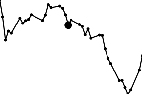
A focused dot can resize and restyle the existing pointer target:
dot(rows, {
  x: 'Date',
  y: 'Close',
  r: 3,
  fill: '#2563eb',
  states: [
    {
      when: { focus: 'primary' },
      style: { r: 7, stroke: 'Canvas', strokeWidth: 2 },
      transition: { type: 'tween', duration: 140, easing: 'ease-out' },
    },
  ],
})
The same definition can make the built-in indicator smaller while retaining its series-colored outline:
const definition = defineChart({
  marks,
  scales,
  focusRing: {
    radius: 4,
    strokeWidth: 2,
    fill: '#ffffff',
  },
})
A focused band emphasizes the shared x value for every series. Its position before the lines places it underneath them:
marks: [
  whenFocused(
    bandX(dates, {
      x: 'date',
      fill: '#64748b',
      fillOpacity: 0.14,
      inset: 3,
    }),
    { match: 'x' },
  ),
  lineY(rows, { x: 'date', y: 'unemployed', color: 'industry' }),
]
Open the grouped focus example to inspect its live chart and complete source.
Follow focus with a crosshair
A crosshair is one dynamic guide driven by the existing focus state. It is not one hidden rule per datum:
marks: [
  crosshair({
    x: {
      band: {
        inset: 0,
        radius: 3,
        fill: '#64748b',
        fillOpacity: 0.16,
      },
      label: true,
    },
    y: false,
  }),
  barY(rows, { x: 'period', y: 'value', color: 'series', inset: 4 }),
  crosshair({
    x: false,
    y: { strokeDasharray: '4 4', label: true },
  }),
]
It follows pointer and keyboard focus, stays out of hit testing, and renders through SVG, Canvas, motion, and chart-owned focus presentation. The first guide uses categorical bandwidth to paint below the bars; with bar inset 4 and band inset 0, it extends 4 pixels past each bar edge. Its x label shows the focused period. The second guide paints the dotted y rule above the bars and labels the focused stack endpoint. Set maxFocusDistance to Number.POSITIVE_INFINITY only when the guides should remain snapped across the complete plot.
Open the stacked cursor-band example to inspect the live chart and complete source.
For synchronized charts or a free two-dimensional cursor, create one controller from @tanstack/charts/cursor and bind it through definition cursor. Focus mode shares semantic x/y values and local charts map them to their own pixels. Free mode shares controlled coordinates without selecting a datum. The complete state and inversion examples are in Interactions and Selections.
Pin and expand rich detail
This energy tooltip stays compact on hover or keyboard focus. Click, Enter, or Space pins the same surface, adds solar coverage to its native rows, and smoothly reveals the detailed consumption and generation breakdown, including an ordinary nested chart. Hover remains chart focus only; framework detail mounts after click or keyboard activation.
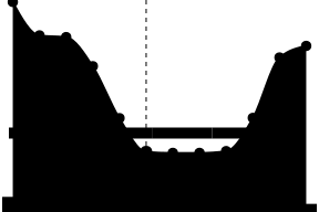
The definition owns stable point identity, the pinned mark state, visibility: 'pinned', placement, portaling, Escape, and focus return. The adapter body receives the pinned point and mounts an ordinary nested chart. The application retains only the same-species cohort policy, close-button presentation, and child-chart content.
The definition's content callback receives pinned, so it can keep the transient summary short and add structured rows only after activation. The React renderTooltipBody callback receives that updated defaultBody and the same pinned state:
<TooltipChart
  definition={definition}
  renderTooltipBody={({ points, defaultBody, pinned, dismiss }) => (
    <EnergyTooltip
      month={points[0].datum}
      summary={defaultBody}
      expanded={pinned}
      onClose={dismiss}
    />
  )}
/>
The detail wrapper stays mounted and transitions from grid-template-rows: 0fr to 1fr; its direct child uses min-height: 0 and overflow: hidden. This animates intrinsic height without measuring content. The transient body remains inert, controls render only while pinned, and the nested consumption chart has its own accessible label and lifecycle.
Add the portal extension to escape clipped ancestors and use viewport collision handling. Wire the close button to dismiss; the shared host also owns Escape, focus return, and non-modal dialog semantics.
Scroll a wide schedule
Native horizontal scrolling is often better than zoom for resource lanes. It preserves a stable time scale and gives the browser proven wheel, touch, and keyboard behavior.

Keep lane labels in a fixed rail and place the timeline in the scroll region. Preserve lane order, task keys, scroll position, and viewport-relative geometry across data updates. Do not capture vertical page scrolling when the timeline only needs horizontal movement.
Position the external rail from onRender with scene.scales.y.map. Do not construct a second band scale to reproduce chart-space label centers.
Use Layout, Axes, and Coordinates to align labels and the plotted region.
Zoom and pan a time domain
zoomX changes a controlled semantic window through the normal definition. The x scale, wheel, drag, touch, keyboard, and reset control all use the same start and end values.
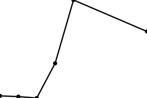
Import zoomX from @tanstack/charts/interaction/zoom, bind its window to a controlled signal, and provide the full extent and allowed scaleExtent. The behavior owns final-scale inversion, configurable wheel capture, pointer-anchored zoom, pan, touch and keyboard input, cancellation, clamping, and teardown. Wheel capture defaults to focused plots. Use wheelActivation: 'modifier' when Control+wheel or Command+wheel should act without prior focus while unmodified wheels continue scrolling the page.
Keep the accepted window, visible-row or clipping policy, y-domain policy, status, reset control, persistence, and follow-latest behavior in application state. Preserve the window when data values update unless product policy explicitly follows the latest point.
Edit an interval
An editable timeline combines direct manipulation with native semantic controls. The chart renders the current record; application validation decides which edit can commit.

A complete editor should:
- Preserve the event's stable ID, start, and lane while its end changes.
- Clamp the end after the start.
- Support pointer cancellation and rollback.
- Offer keyboard-adjustable handles with adequate hit targets.
- Provide a native date or range input.
- Announce the current duration and validation state.
- Keep color-independent event labels visible.
Do not mutate a rectangle and treat that painted geometry as the saved record. Update application state, validate it, and let the next definition produce the scene.
State and lifecycle
Application-owned interaction state should be semantic:
- Date or numeric domain
- Selected row ID
- Start and end values
- Scroll offset
- Playback index
- Pinned datum key
- Shared cursor x/y value
Pixel geometry is derived from scene.chart and resolved scales on each render. This keeps state valid after responsive layout, font changes, and server hydration.
Controllers and overlays may install pointer capture, event listeners, observers, nested hosts, and animation frames. Tear down every resource when the chart unmounts or ownership changes.
Production checks
- Pointer, keyboard, and touch reach equivalent semantic outcomes.
- Focus indicators and controls remain visible and contained.
- Wheel handling does not unexpectedly trap page scrolling.
- Dragging has commit, cancel, clamp, and out-of-bounds behavior.
- Selection and viewport survive data and size updates.
- Reset behavior is explicit.
- Native chart focus is disabled only when another complete interaction owns the surface.
- Rich overlays and nested charts have independent accessibility and cleanup.
- Interaction state is tested as values, not only screenshots or DOM order.
Use Testing and Debugging for behavior scenarios and Accessibility for equivalent input paths.











'%3e%3cpath%20d='M117.436%20207.036V154.604L118.529%20153.51H129.452L130.545%20154.604V207.036L129.452%20208.13H118.529L117.436%20207.036Z'%20fill='%2305BDBA'/%3e%3cpath%20d='M117.436%2053.5225V1.09339L118.529%200H129.452L130.545%201.09339V53.5225L129.452%2054.6159H118.529L117.436%2053.5225Z'%20fill='%2305BDBA'/%3e%3cpath%20d='M69.9539%20169.238H68.4094L60.6869%20161.512V159.967L78.7201%20141.938L86.8976%20141.942L87.9948%20143.031V151.209L69.9539%20169.238Z'%20fill='%2305BDBA'/%3e%3cpath%20d='M69.9462%2038.8917H68.4017L60.6792%2046.6181V48.1626L78.7124%2066.192L86.8899%2066.1882L87.9871%2065.0986V56.9212L69.9462%2038.8917Z'%20fill='%2305BDBA'/%3e%3cpath%20d='M1.09339%2097.5104H75.3711L76.4645%2098.6038V109.526L75.3711%20110.62H1.09339L0%20109.526V98.6038L1.09339%2097.5104Z'%20fill='%2305BDBA'/%3e%3cpath%20d='M440.999%2097.5104H510.91L512.004%2098.6038V109.526L510.91%20110.62H436.633L435.539%20109.526L439.905%2098.6038L440.999%2097.5104Z'%20fill='%2305BDBA'/%3e%3cpath%20d='M212.056%20108.727L210.963%20109.821H177.079L175.986%20110.914C175.986%20113.101%20178.173%20119.657%20186.916%20119.657C190.196%20119.657%20193.472%20118.564%20194.566%20116.377L195.659%20115.284H208.776L209.869%20116.377C208.776%20122.934%20203.313%20132.774%20186.916%20132.774C168.336%20132.774%20159.589%20119.657%20159.589%20104.357C159.589%2089.0576%20168.332%2075.9408%20185.822%2075.9408C203.313%2075.9408%20212.056%2089.0576%20212.056%20104.357V108.731V108.727ZM195.659%2097.7971C195.659%2096.7037%20194.566%2089.0538%20185.822%2089.0538C177.079%2089.0538%20175.986%2096.7037%20175.986%2097.7971L177.079%2098.8905H194.566L195.659%2097.7971Z'%20fill='%23014847'/%3e%3cpath%20d='M242.66%20115.284C242.66%20117.47%20243.753%20118.564%20245.94%20118.564H255.776L256.87%20119.657V130.587L255.776%20131.681H245.94C236.103%20131.681%20227.36%20127.307%20227.36%20115.284V91.2368L226.266%2090.1434H218.617L217.523%2089.05V78.1199L218.617%2077.0265H226.266L227.36%2075.9332V66.0965L228.453%2065.0031H241.57L242.663%2066.0965V75.9332L243.757%2077.0265H255.78L256.874%2078.1199V89.05L255.78%2090.1434H243.757L242.663%2091.2368V115.284H242.66Z'%20fill='%23014847'/%3e%3cpath%20d='M283.1%20131.681H269.983L268.889%20130.587V56.2636L269.983%2055.1702H283.1L284.193%2056.2636V130.587L283.1%20131.681Z'%20fill='%23014847'/%3e%3cpath%20d='M312.61%2068.2871H299.493L298.399%2067.1937V56.2636L299.493%2055.1702H312.61L313.703%2056.2636V67.1937L312.61%2068.2871ZM312.61%20131.681H299.493L298.399%20130.587V78.1237L299.493%2077.0304H312.61L313.703%2078.1237V130.587L312.61%20131.681Z'%20fill='%23014847'/%3e%3cpath%20d='M363.98%2056.2636V67.1937L362.886%2068.2871H353.05C350.863%2068.2871%20349.769%2069.3805%20349.769%2071.5672V75.9408L350.863%2077.0342H361.793L362.886%2078.1276V89.0576L361.793%2090.151H350.863L349.769%2091.2444V130.591L348.676%20131.684H335.559L334.466%20130.591V91.2444L333.372%2090.151H325.723L324.629%2089.0576V78.1276L325.723%2077.0342H333.372L334.466%2075.9408V71.5672C334.466%2059.5438%20343.209%2055.1702%20353.046%2055.1702H362.882L363.976%2056.2636H363.98Z'%20fill='%23014847'/%3e%3cpath%20d='M404.42%20132.774C400.046%20143.704%20395.677%20150.261%20380.373%20150.261H374.906L373.813%20149.167V138.237L374.906%20137.144H380.373C385.836%20137.144%20386.929%20136.05%20388.023%20132.77V131.677L370.536%2089.05V78.1199L371.63%2077.0265H381.466L382.56%2078.1199L395.677%20115.284H396.77L409.887%2078.1199L410.98%2077.0265H420.817L421.91%2078.1199V89.05L404.424%20132.77L404.42%20132.774Z'%20fill='%23014847'/%3e%3cpath%20d='M135.454%20131.681L134.361%20130.587L134.368%2098.9172C134.368%2093.4541%20132.22%2089.2182%20125.625%2089.0806C122.234%2088.9926%20118.354%2089.0729%20114.209%2089.2488L113.59%2089.8834L113.598%20130.587L112.504%20131.681H99.3913L98.2979%20130.587V77.5388L99.3913%2076.4454L128.901%2076.1778C143.685%2076.1778%20149.668%2086.3356%20149.668%2097.8009V130.587L148.575%20131.681H135.454Z'%20fill='%23014847'/%3e%3c/g%3e%3cdefs%3e%3cclipPath%20id='clip0_235_8'%3e%3crect%20width='512'%20height='208.126'%20fill='white'/%3e%3c/clipPath%3e%3c/defs%3e%3c/svg%3e)
'%3e%3cpath%20d='M117.436%20207.036V154.604L118.529%20153.51H129.452L130.545%20154.604V207.036L129.452%20208.13H118.529L117.436%20207.036Z'%20fill='%2332E6E2'/%3e%3cpath%20d='M117.436%2053.5225V1.09339L118.529%200H129.452L130.545%201.09339V53.5225L129.452%2054.6159H118.529L117.436%2053.5225Z'%20fill='%2332E6E2'/%3e%3cpath%20d='M69.9539%20169.238H68.4094L60.6869%20161.512V159.967L78.7201%20141.938L86.8976%20141.942L87.9948%20143.031V151.209L69.9539%20169.238Z'%20fill='%2332E6E2'/%3e%3cpath%20d='M69.9462%2038.8917H68.4017L60.6792%2046.6181V48.1626L78.7124%2066.192L86.8899%2066.1882L87.9871%2065.0986V56.9212L69.9462%2038.8917Z'%20fill='%2332E6E2'/%3e%3cpath%20d='M1.09339%2097.5104H75.3711L76.4645%2098.6038V109.526L75.3711%20110.62H1.09339L0%20109.526V98.6038L1.09339%2097.5104Z'%20fill='%2332E6E2'/%3e%3cpath%20d='M440.999%2097.5104H510.91L512.004%2098.6038V109.526L510.91%20110.62H436.633L435.539%20109.526L439.905%2098.6038L440.999%2097.5104Z'%20fill='%2332E6E2'/%3e%3cpath%20d='M212.056%20108.727L210.963%20109.821H177.079L175.986%20110.914C175.986%20113.101%20178.173%20119.657%20186.916%20119.657C190.196%20119.657%20193.472%20118.564%20194.566%20116.377L195.659%20115.284H208.776L209.869%20116.377C208.776%20122.934%20203.313%20132.774%20186.916%20132.774C168.336%20132.774%20159.589%20119.657%20159.589%20104.357C159.589%2089.0576%20168.332%2075.9408%20185.822%2075.9408C203.313%2075.9408%20212.056%2089.0576%20212.056%20104.357V108.731V108.727ZM195.659%2097.7971C195.659%2096.7037%20194.566%2089.0538%20185.822%2089.0538C177.079%2089.0538%20175.986%2096.7037%20175.986%2097.7971L177.079%2098.8905H194.566L195.659%2097.7971Z'%20fill='white'/%3e%3cpath%20d='M242.66%20115.284C242.66%20117.47%20243.753%20118.564%20245.94%20118.564H255.776L256.87%20119.657V130.587L255.776%20131.681H245.94C236.103%20131.681%20227.36%20127.307%20227.36%20115.284V91.2368L226.266%2090.1434H218.617L217.523%2089.05V78.1199L218.617%2077.0265H226.266L227.36%2075.9332V66.0965L228.453%2065.0031H241.57L242.663%2066.0965V75.9332L243.757%2077.0265H255.78L256.874%2078.1199V89.05L255.78%2090.1434H243.757L242.663%2091.2368V115.284H242.66Z'%20fill='white'/%3e%3cpath%20d='M283.1%20131.681H269.983L268.889%20130.587V56.2636L269.983%2055.1702H283.1L284.193%2056.2636V130.587L283.1%20131.681Z'%20fill='white'/%3e%3cpath%20d='M312.61%2068.2871H299.493L298.399%2067.1937V56.2636L299.493%2055.1702H312.61L313.703%2056.2636V67.1937L312.61%2068.2871ZM312.61%20131.681H299.493L298.399%20130.587V78.1237L299.493%2077.0304H312.61L313.703%2078.1237V130.587L312.61%20131.681Z'%20fill='white'/%3e%3cpath%20d='M363.98%2056.2636V67.1937L362.886%2068.2871H353.05C350.863%2068.2871%20349.769%2069.3805%20349.769%2071.5672V75.9408L350.863%2077.0342H361.793L362.886%2078.1276V89.0576L361.793%2090.151H350.863L349.769%2091.2444V130.591L348.676%20131.684H335.559L334.466%20130.591V91.2444L333.372%2090.151H325.723L324.629%2089.0576V78.1276L325.723%2077.0342H333.372L334.466%2075.9408V71.5672C334.466%2059.5438%20343.209%2055.1702%20353.046%2055.1702H362.882L363.976%2056.2636H363.98Z'%20fill='white'/%3e%3cpath%20d='M404.42%20132.774C400.046%20143.704%20395.677%20150.261%20380.373%20150.261H374.906L373.813%20149.167V138.237L374.906%20137.144H380.373C385.836%20137.144%20386.929%20136.05%20388.023%20132.77V131.677L370.536%2089.05V78.1199L371.63%2077.0265H381.466L382.56%2078.1199L395.677%20115.284H396.77L409.887%2078.1199L410.98%2077.0265H420.817L421.91%2078.1199V89.05L404.424%20132.77L404.42%20132.774Z'%20fill='white'/%3e%3cpath%20d='M135.454%20131.681L134.361%20130.587L134.368%2098.9172C134.368%2093.4541%20132.22%2089.2182%20125.625%2089.0806C122.234%2088.9926%20118.354%2089.0729%20114.209%2089.2488L113.59%2089.8834L113.598%20130.587L112.504%20131.681H99.3913L98.2979%20130.587V77.5388L99.3913%2076.4454L128.901%2076.1778C143.685%2076.1778%20149.668%2086.3356%20149.668%2097.8009V130.587L148.575%20131.681H135.454Z'%20fill='white'/%3e%3c/g%3e%3cdefs%3e%3cclipPath%20id='clip0_235_26'%3e%3crect%20width='512'%20height='208.126'%20fill='white'/%3e%3c/clipPath%3e%3c/defs%3e%3c/svg%3e)

'%3e%3cpath%20d='M255.264%2025.3765H279.579L297.086%2097.519C300.332%20111.135%20300.976%20119.244%20300.976%20119.244H301.304C301.304%20119.244%20302.435%20111.306%20305.681%2097.519L322.373%2025.3765H349.934L367.599%2097.519C371.003%20111.622%20371.818%20119.244%20371.818%20119.244H372.304C372.304%20119.244%20372.632%20111.622%20375.866%2097.519L392.729%2025.3765H417.043L386.249%20143.717H359.174L340.536%2072.0612C336.646%2056.4997%20336.318%2049.5334%20336.318%2049.5334H335.99C335.99%2049.5334%20335.661%2056.4997%20332.099%2072.0612L314.592%20143.717H286.715L255.264%2025.3765Z'%20fill='white'/%3e%3cpath%20d='M412.984%20100.726C412.984%2073.6509%20430.491%2056.1442%20456.921%2056.1442C483.181%2056.1442%20500.688%2073.6509%20500.688%20100.726C500.688%20127.958%20483.181%20145.635%20456.921%20145.635C430.503%20145.623%20412.984%20127.958%20412.984%20100.726ZM477.99%20100.726C477.99%2083.2189%20469.565%2073.3227%20456.921%2073.3227C443.305%2073.3227%20435.682%2084.3495%20435.682%20100.726C435.682%20118.561%20444.107%20128.445%20456.921%20128.445C470.537%20128.445%20477.99%20117.418%20477.99%20100.726Z'%20fill='white'/%3e%3cpath%20d='M511.545%2057.4711H533.101V73.3609H533.587C537.319%2065.0938%20546.231%2056.8267%20561.464%2056.8267C564.054%2056.8267%20565.683%2057.155%20566.813%2057.4711V79.0263H566.169C566.169%2079.0263%20564.224%2078.3819%20558.875%2078.3819C542.182%2078.3819%20533.101%2088.266%20533.101%20106.745V143.704H511.545V57.4711Z'%20fill='white'/%3e%3cpath%20d='M576.868%2025.3765H598.423V63.3079C598.423%2085.6776%20598.095%2089.7261%20598.095%2089.7261H598.423L630.519%2057.4723H657.424L619.833%2094.7592L663.442%20143.717H637.984L606.532%20108.047L598.423%20115.986V143.705H576.868V25.3765Z'%20fill='white'/%3e%3cpath%20d='M663.757%2084.9796C663.757%2048.5072%20686.455%2024.1923%20720.496%2024.1923C754.537%2024.1923%20777.235%2048.5072%20777.235%2084.9796C777.235%20121.452%20754.537%20145.767%20720.496%20145.767C686.455%20145.767%20663.757%20121.452%20663.757%2084.9796ZM753.722%2084.9796C753.722%2060.1784%20740.434%2043.474%20720.483%2043.474C700.533%2043.474%20687.257%2060.1784%20687.257%2084.9796C687.257%20109.781%20700.545%20126.485%20720.483%20126.485C740.422%20126.485%20753.722%20109.781%20753.722%2084.9796Z'%20fill='white'/%3e%3cpath%20d='M785.488%20104.326H810.131C810.131%20118.271%20819.699%20126.052%20834.288%20126.052C846.603%20126.052%20855.041%20119.888%20855.041%20111.135C855.041%20101.25%20848.561%2098.6488%20827.966%2094.6003C809.158%2090.868%20789.22%2084.5461%20789.22%2059.9029C789.22%2039.3203%20806.727%2023.7587%20833.473%2023.7587C861.35%2023.7587%20878.541%2038.3477%20878.541%2060.3892H853.898C853.898%2049.6906%20845.631%2043.0405%20833.473%2043.0405C821.158%2043.0405%20813.535%2049.0341%20813.535%2057.7875C813.535%2067.0272%20818.884%2070.5893%20835.419%2073.9934C859.892%2079.1847%20880%2081.9323%20880%20109.165C880%20130.745%20861.192%20145.333%20833.473%20145.333C805.268%20145.333%20785.488%20128.957%20785.488%20104.326Z'%20fill='white'/%3e%3cpath%20d='M0%2084.0003C0%2087.6782%200.967855%2091.356%202.83904%2094.5177L36.7785%20153.299C40.2628%20159.299%2045.5537%20164.203%2052.1351%20166.397C65.1044%20170.72%2078.5253%20165.171%2084.9131%20154.073L93.1076%20139.878L60.7813%2084.0003L94.9143%2024.8321L103.109%2010.6369C105.561%206.37836%20108.851%202.89408%20112.723%200.119568H109.174H60.0715C50.8446%200.119568%2042.3275%205.02337%2037.7463%2013.0243L2.83904%2073.483C0.967855%2076.6446%200%2080.3225%200%2084.0003Z'%20fill='white'/%3e%3cpath%20d='M193.571%2083.9997C193.571%2080.3219%20192.603%2076.644%20190.732%2073.4824L156.341%2013.9271C149.953%202.89352%20136.532%20-2.65551%20123.563%201.60305C116.982%203.79685%20111.691%208.70065%20108.206%2014.7013L100.464%2028.0577L132.79%2083.9997L98.6569%20143.168L90.4624%20157.363C88.0105%20161.557%2084.7198%20165.106%2080.8484%20167.88H84.3972H133.5C142.727%20167.88%20151.244%20162.977%20155.825%20154.976L190.732%2094.5171C192.603%2091.3554%20193.571%2087.6776%20193.571%2083.9997Z'%20fill='white'/%3e%3c/g%3e%3cdefs%3e%3cclipPath%20id='clip0_1647_45'%3e%3crect%20width='880'%20height='168'%20fill='white'/%3e%3c/clipPath%3e%3c/defs%3e%3c/svg%3e)






'%3e%3cg%20fill-rule='nonzero'%3e%3cpath%20d='m1099.4%20549.4v-12.5h-21.3l-12.5%2012.5z'%20fill='%23ff8b00'/%3e%3cpath%20d='m1123.4%20518.4h-26.7l-12.6%2012.5h39.3z'%20fill='%2355b2c6'/%3e%3cpath%20d='m1053.2%20561.9%206.4-6.4h21.6v12.5h-28z'%20fill='%23f00'/%3e%3cpath%20d='m1057.9%20543.3h13.8l12.6-12.5h-26.4z'%20fill='%23b4bbbf'/%3e%3cpath%20d='m1042.8%20561.9h10.4l12.4-12.5h-22.8z'%20fill='%23b4bbbf'/%3e%3cpath%20d='m1096.7%20518.4-6.4%206.4h-40.8v-12.5h47.2z'%20fill='%23b4bbbf'/%3e%3cpath%20d='m828.6%20559.7h-19.6l-3.4%208.4h-8.6l18.1-42.4h7.5l18.1%2042.4h-8.7zm-2.7-6.7-7.1-17.3-7.1%2017.3z'%20fill='%23031c4c'/%3e%3cpath%20d='m960.1%20541.3c2.5-3.7%208.8-4.1%2011.4-4.1v7.2c-3.2%200-6.4.1-8.3%201.5s-2.9%203.3-2.9%205.6v16.6h-7.8v-30.9h7.5z'%20fill='%23031c4c'/%3e%3c/g%3e%3cpath%20d='m975.8%20537.2h7.8v30.9h-7.8z'%20fill='%23031c4c'/%3e%3cpath%20d='m975.8%20523.4h7.8v9.2h-7.8z'%20fill='%23031c4c'/%3e%3cpath%20d='m1022.3%20523.4v44.7h-7.5l-.2-4.7c-1.1%201.6-2.5%202.9-4.2%203.9-1.7.9-3.8%201.4-6.2%201.4-2.1%200-4.1-.4-5.8-1.1-1.8-.8-3.4-1.8-4.7-3.2s-2.4-3.1-3.1-5c-.8-1.9-1.1-4.1-1.1-6.5s.4-4.6%201.1-6.6c.8-2%201.8-3.7%203.1-5.1s2.9-2.5%204.7-3.3%203.7-1.2%205.8-1.2c2.4%200%204.4.4%206.1%201.3s3.1%202.1%204.2%203.8v-18.3h7.8zm-16.4%2038.6c2.6%200%204.6-.9%206.2-2.6s2.4-4%202.4-6.8-.8-5-2.4-6.8c-1.6-1.7-3.6-2.6-6.2-2.6-2.5%200-4.6.9-6.1%202.6-1.6%201.7-2.4%204-2.4%206.8s.8%205%202.4%206.7c1.6%201.8%203.6%202.7%206.1%202.7'%20fill='%23031c4c'%20fill-rule='nonzero'/%3e%3cpath%20d='m885.8%20544.2h-19.3v6.7h11c-.3%203.4-1.6%206-3.8%208.1-2.2%202-5%203-8.6%203-2%200-3.9-.4-5.5-1.1-1.7-.7-3.1-1.7-4.3-3.1-1.2-1.3-2.1-2.9-2.8-4.8s-1-3.9-1-6.2.3-4.3%201-6.2c.6-1.9%201.6-3.4%202.8-4.8%201.2-1.3%202.6-2.3%204.3-3.1%201.7-.7%203.5-1.1%205.6-1.1%204.2%200%207.4%201%209.6%203l5.2-5.2c-3.9-3-8.9-4.6-14.8-4.6-3.3%200-6.3.5-9%201.6s-5%202.5-6.9%204.4-3.4%204.2-4.4%206.9-1.5%205.7-1.5%208.9.5%206.2%201.6%208.9%202.5%205%204.4%206.9%204.2%203.4%206.9%204.4c2.7%201.1%205.7%201.6%208.9%201.6s6.1-.5%208.7-1.6%204.8-2.5%206.6-4.4%203.2-4.2%204.2-6.9%201.5-5.7%201.5-8.9v-1.3c-.3-.2-.4-.7-.4-1.1'%20fill='%23031c4c'%20fill-rule='nonzero'/%3e%3cpath%20d='m946.8%20544.2h-19.3v6.7h11c-.3%203.4-1.6%206-3.8%208.1-2.2%202-5%203-8.6%203-2%200-3.9-.4-5.5-1.1-1.7-.7-3.1-1.7-4.3-3.1-1.2-1.3-2.1-2.9-2.8-4.8s-1-3.9-1-6.2.3-4.3%201-6.2c.6-1.9%201.6-3.4%202.8-4.8%201.2-1.3%202.6-2.3%204.3-3.1%201.7-.7%203.5-1.1%205.6-1.1%204.2%200%207.4%201%209.6%203l5.2-5.2c-3.9-3-8.9-4.6-14.8-4.6-3.3%200-6.3.5-9%201.6s-5%202.5-6.9%204.4-3.4%204.2-4.4%206.9-1.5%205.7-1.5%208.9.5%206.2%201.6%208.9%202.5%205%204.4%206.9%204.2%203.4%206.9%204.4c2.7%201.1%205.7%201.6%208.9%201.6s6.1-.5%208.7-1.6%204.8-2.5%206.6-4.4%203.2-4.2%204.2-6.9%201.5-5.7%201.5-8.9v-1.3c-.3-.2-.4-.7-.4-1.1'%20fill='%23031c4c'%20fill-rule='nonzero'/%3e%3c/g%3e%3c/svg%3e)
'%3e%3cg%20fill-rule='nonzero'%3e%3cpath%20d='m1099.4%20549.4v-12.5h-21.3l-12.5%2012.5z'%20fill='%23ff8b00'/%3e%3cpath%20d='m1123.4%20518.4h-26.7l-12.6%2012.5h39.3z'%20fill='%2355b2c6'/%3e%3cpath%20d='m1053.2%20561.9%206.4-6.4h21.6v12.5h-28z'%20fill='%23f00'/%3e%3cpath%20d='m1057.9%20543.3h13.8l12.6-12.5h-26.4z'%20fill='%23b4bbbf'/%3e%3cpath%20d='m1042.8%20561.9h10.4l12.4-12.5h-22.8z'%20fill='%23b4bbbf'/%3e%3cpath%20d='m1096.7%20518.4-6.4%206.4h-40.8v-12.5h47.2z'%20fill='%23b4bbbf'/%3e%3cpath%20d='m828.6%20559.7h-19.6l-3.4%208.4h-8.6l18.1-42.4h7.5l18.1%2042.4h-8.7zm-2.7-6.7-7.1-17.3-7.1%2017.3z'%20fill='%23fff'/%3e%3cpath%20d='m960.1%20541.3c2.5-3.7%208.8-4.1%2011.4-4.1v7.2c-3.2%200-6.4.1-8.3%201.5s-2.9%203.3-2.9%205.6v16.6h-7.8v-30.9h7.5z'%20fill='%23fff'/%3e%3c/g%3e%3cpath%20d='m975.8%20537.2h7.8v30.9h-7.8z'%20fill='%23fff'/%3e%3cpath%20d='m975.8%20523.4h7.8v9.2h-7.8z'%20fill='%23fff'/%3e%3cpath%20d='m1022.3%20523.4v44.7h-7.5l-.2-4.7c-1.1%201.6-2.5%202.9-4.2%203.9-1.7.9-3.8%201.4-6.2%201.4-2.1%200-4.1-.4-5.8-1.1-1.8-.8-3.4-1.8-4.7-3.2s-2.4-3.1-3.1-5c-.8-1.9-1.1-4.1-1.1-6.5s.4-4.6%201.1-6.6c.8-2%201.8-3.7%203.1-5.1s2.9-2.5%204.7-3.3%203.7-1.2%205.8-1.2c2.4%200%204.4.4%206.1%201.3s3.1%202.1%204.2%203.8v-18.3h7.8zm-16.4%2038.6c2.6%200%204.6-.9%206.2-2.6s2.4-4%202.4-6.8-.8-5-2.4-6.8c-1.6-1.7-3.6-2.6-6.2-2.6-2.5%200-4.6.9-6.1%202.6-1.6%201.7-2.4%204-2.4%206.8s.8%205%202.4%206.7c1.6%201.8%203.6%202.7%206.1%202.7'%20fill='%23fff'%20fill-rule='nonzero'/%3e%3cpath%20d='m885.8%20544.2h-19.3v6.7h11c-.3%203.4-1.6%206-3.8%208.1-2.2%202-5%203-8.6%203-2%200-3.9-.4-5.5-1.1-1.7-.7-3.1-1.7-4.3-3.1-1.2-1.3-2.1-2.9-2.8-4.8s-1-3.9-1-6.2.3-4.3%201-6.2c.6-1.9%201.6-3.4%202.8-4.8%201.2-1.3%202.6-2.3%204.3-3.1%201.7-.7%203.5-1.1%205.6-1.1%204.2%200%207.4%201%209.6%203l5.2-5.2c-3.9-3-8.9-4.6-14.8-4.6-3.3%200-6.3.5-9%201.6s-5%202.5-6.9%204.4-3.4%204.2-4.4%206.9-1.5%205.7-1.5%208.9.5%206.2%201.6%208.9%202.5%205%204.4%206.9%204.2%203.4%206.9%204.4c2.7%201.1%205.7%201.6%208.9%201.6s6.1-.5%208.7-1.6%204.8-2.5%206.6-4.4%203.2-4.2%204.2-6.9%201.5-5.7%201.5-8.9v-1.3c-.3-.2-.4-.7-.4-1.1'%20fill='%23fff'%20fill-rule='nonzero'/%3e%3cpath%20d='m946.8%20544.2h-19.3v6.7h11c-.3%203.4-1.6%206-3.8%208.1-2.2%202-5%203-8.6%203-2%200-3.9-.4-5.5-1.1-1.7-.7-3.1-1.7-4.3-3.1-1.2-1.3-2.1-2.9-2.8-4.8s-1-3.9-1-6.2.3-4.3%201-6.2c.6-1.9%201.6-3.4%202.8-4.8%201.2-1.3%202.6-2.3%204.3-3.1%201.7-.7%203.5-1.1%205.6-1.1%204.2%200%207.4%201%209.6%203l5.2-5.2c-3.9-3-8.9-4.6-14.8-4.6-3.3%200-6.3.5-9%201.6s-5%202.5-6.9%204.4-3.4%204.2-4.4%206.9-1.5%205.7-1.5%208.9.5%206.2%201.6%208.9%202.5%205%204.4%206.9%204.2%203.4%206.9%204.4c2.7%201.1%205.7%201.6%208.9%201.6s6.1-.5%208.7-1.6%204.8-2.5%206.6-4.4%203.2-4.2%204.2-6.9%201.5-5.7%201.5-8.9v-1.3c-.3-.2-.4-.7-.4-1.1'%20fill='%23fff'%20fill-rule='nonzero'/%3e%3c/g%3e%3c/svg%3e)
'/%3e%3c/svg%3e)
'/%3e%3c/svg%3e)